Education Web

Case Study

Education Web

A learning community dedicated to building responsible citizens and empowering all learners.
PROJECT

Description

What's special about this app?

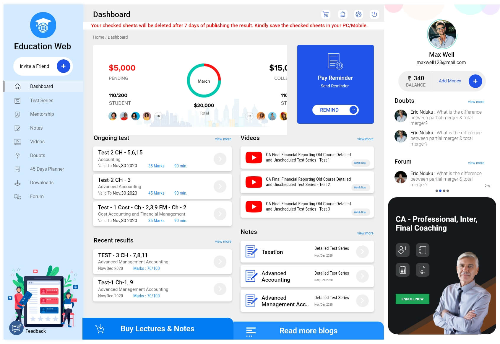
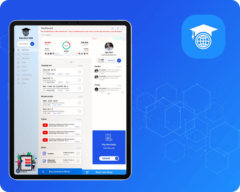
Education Web is a subscription-based platform that administers online exams on a variety of topics, evaluates them, and awards prizes to the top students. For a better experience, the app has a basic UI and UX. Students have their own dashboard where they can see their test history with a section-by-section breakdown of the marks to get insights. The app has proven a huge hit with students of all ages and classes.

Project Goal

The primary goal for developing this app was to create web and application platforms for ANDROID and iOS users. We planned, designed, and developed an application for the education sector. The client was sure about what he wanted to achieve with the platform. That helped us get the right start and made it easier to lay out the scope and budget. We later finalized on many phone calls the “must-have” features and functionality of the platform. Doing this helped us design the solution very smoothly.

The main goal of the Education Web is to

  • Enhance the quality of learning and teaching
  • Meet the learning style or needs of students
  • Improve the efficiency and effectiveness
  • Improve user accessibility and time flexibility to engage learners in the learning process.
circle image 6

Easy Food ordering Process and increase trust in restaurants and customers

circle image 5

Helps restaurant to reach out to wider range of customers

UI

Colors

.
#1F53E9
#49a5ff
.

#000000

.

#6d6e6d

.

#EFEFEF

.

#1f53e9

.
#1e8ffd
.

#FF0000

.
#ffffff

Challenges

Problems

Solutions

Visual Design

Onboarding

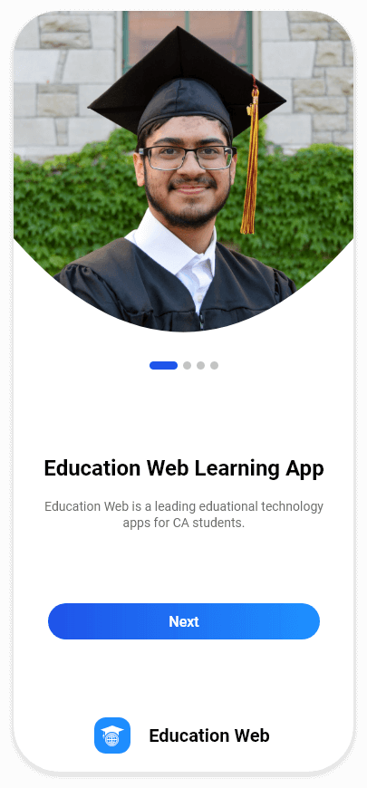
Onboarding is basically a series screen that guides users through the app’s interface, functions, and other features.

Login

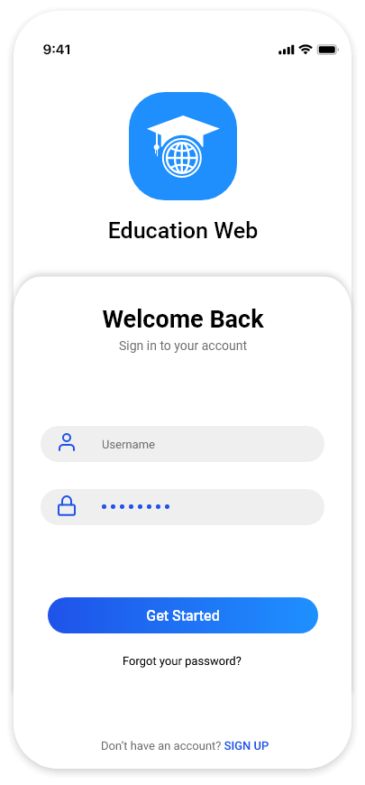
The login page is the entry page to the app that requires user ID and authentication. This is done by regularly entering a username/password combination. Login can be used to gain access to the app.
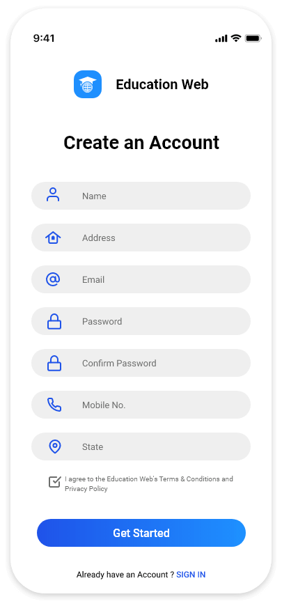
Create an account

Allow the user to register and provide users with the ability to create and log in, giving them security and control over their data. If a user is able to see their profile information, it allows them to understand how you are connecting with them.

Home

Home screen is the main screen of an application. This is where the action happens: you can start apps, use widgets and see what’s happening via status and notification icons. Every phone might have a different screen or appearance.
Visual Design

Signup
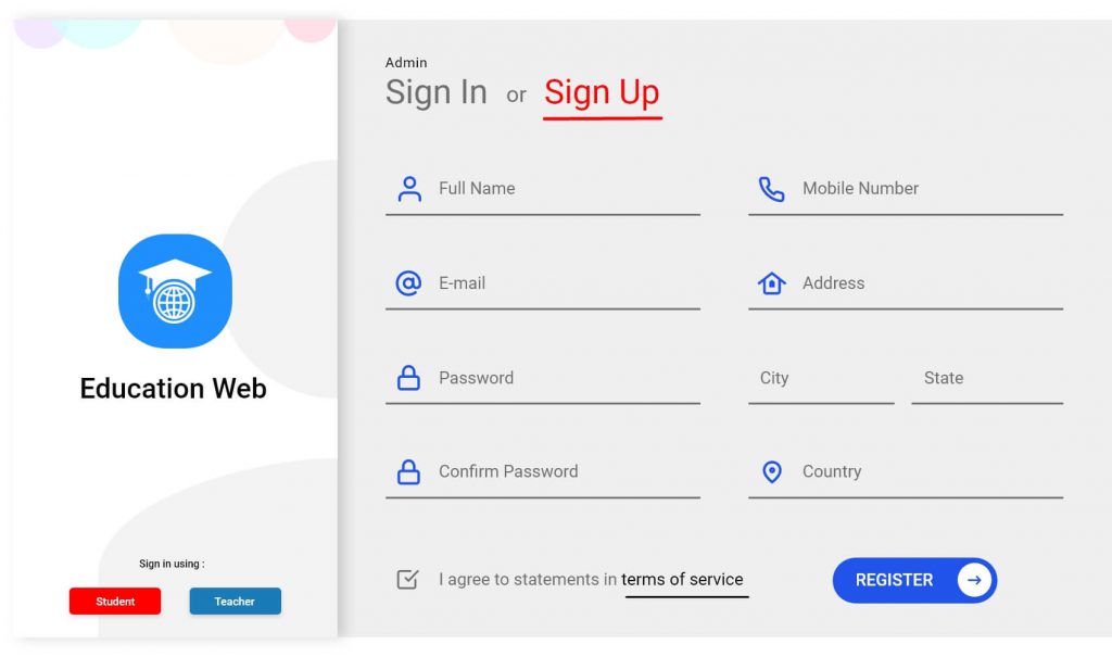
We strive to keep things easy and trendy for the home screen. So travellers will easily locate the information needed.

Signup

We strive to keep things easy and trendy for the home screen. So travellers will easily locate the information needed.

View Similar Case Studies

  • Education Web - A learning community dedicated to building responsible citizens and empowering all learners.
  • DocWeb - Helping people at their most vulnerable times is a privilege.
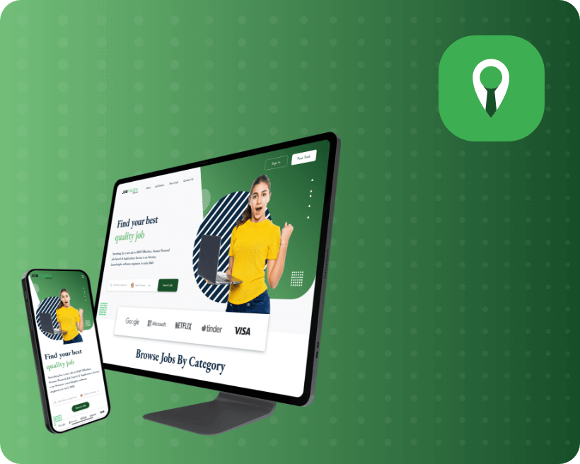
  • Job Finder Website - "More than a job… it's an adventure in innovation."

DocWeb

Case Study

DocWeb

Helping people at their most vulnerable times is a privilege.
PROJECT

Description

What's special about this app?

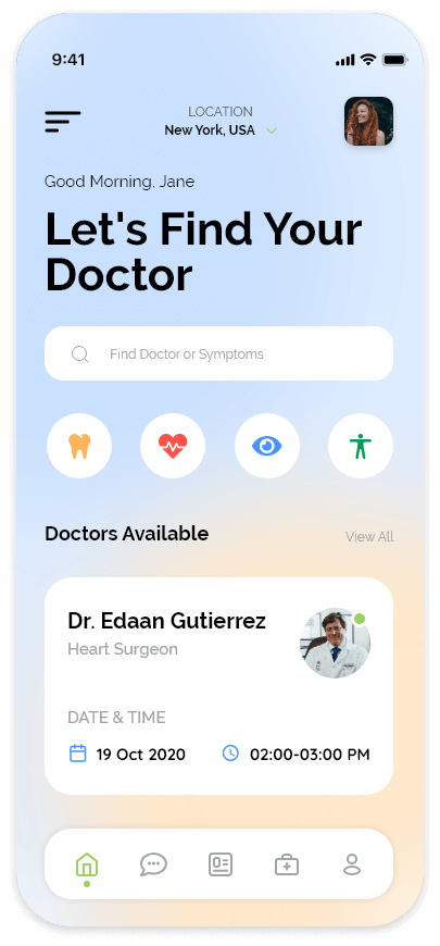
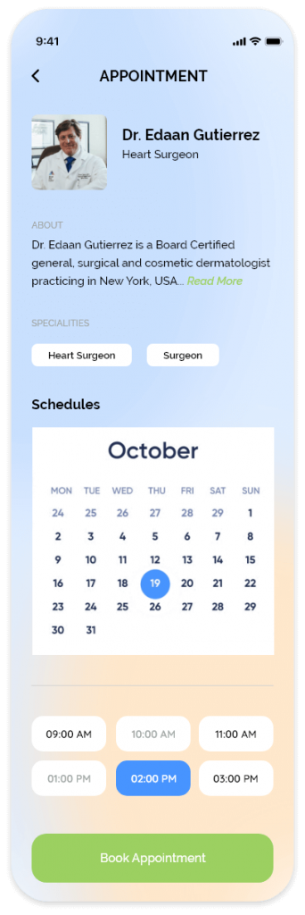
The main purpose of DocWeb is to search for a nearby doctor or hospital. This system offers separate workspaces for patients and doctors. The system allows users to locate a specialist doctor within walking distance. The appointment calendar shows available slots and allows users to book appointments. This system allows users to easily reschedule appointments as needed. A relative’s name can be attached to the same registration number. In the login, the user can add a favorite doctor whom they see often. For planned appointments, the customers receive notifications and reminders via email.

Project Goal

The primary purpose of the DocWeb system was to make it easier for doctors and patients to maintain their databases. The hospital can manage their data digitally, which is secure and safe. This system allows doctors to find their patients’ daily appointments quickly. In an emergency, patients can find out where they need to go. The system provides a map that can be used to guide patients to the hospital. Patients can rate doctors using 5-star ratings.


In case of an emergency, you can reschedule an existing appointment. Create a dynamic calendar and book your appointment with your preferred doctor immediately. You can easily switch between daily, weekly, and monthly views and view your schedule for future appointments.

Use our customized search engine to locate a doctor or clinic near you.

docweb bubble 4

Easy Food ordering Process and increase trust in restaurants and customers

docweb bubble 3

Helps restaurant to reach out to wider range of customers

UI

Colors

.

#000000

.

#A0A6A4

.

#9CD061

.

#4794FE

.

#FFE7CB

.

#C6E5F7

.
#ffffff

Challenges

Problems

Solutions

Visual Design

Onboarding

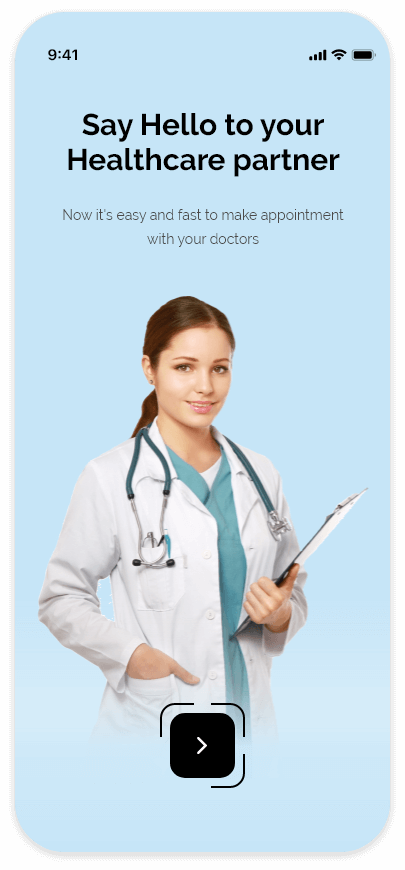
Onboarding is basically a series screen that guides users through the app’s interface, functions, and other features.

Home

The home screen is the main screen of an application. This is where the action happens: you can start apps, use widgets and see what’s happening via status and notification icons. Every phone might have a different screen or appearance.

Appointment

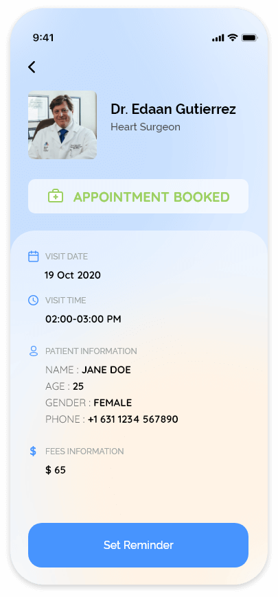
After the patient has chosen the right doctor, he can request an appointment. The patient can also use the built-in chat to discuss any questions or concerns. After the doctor and patient have discussed everything, the doctor confirms the appointment request.

Confirmation

Users are informed about the appointment confirmation.

View Similar Case Studies

  • Education Web - A learning community dedicated to building responsible citizens and empowering all learners.
  • DocWeb - Helping people at their most vulnerable times is a privilege.
  • Job Finder Website - "More than a job… it's an adventure in innovation."

Job Finder Website

jobfinder_icon
Case Study

Job Finder App

“More than a job… it’s an adventure in innovation.”

PROJECT

Description

Job Finder's mission is to find the perfect match between people and jobs ?

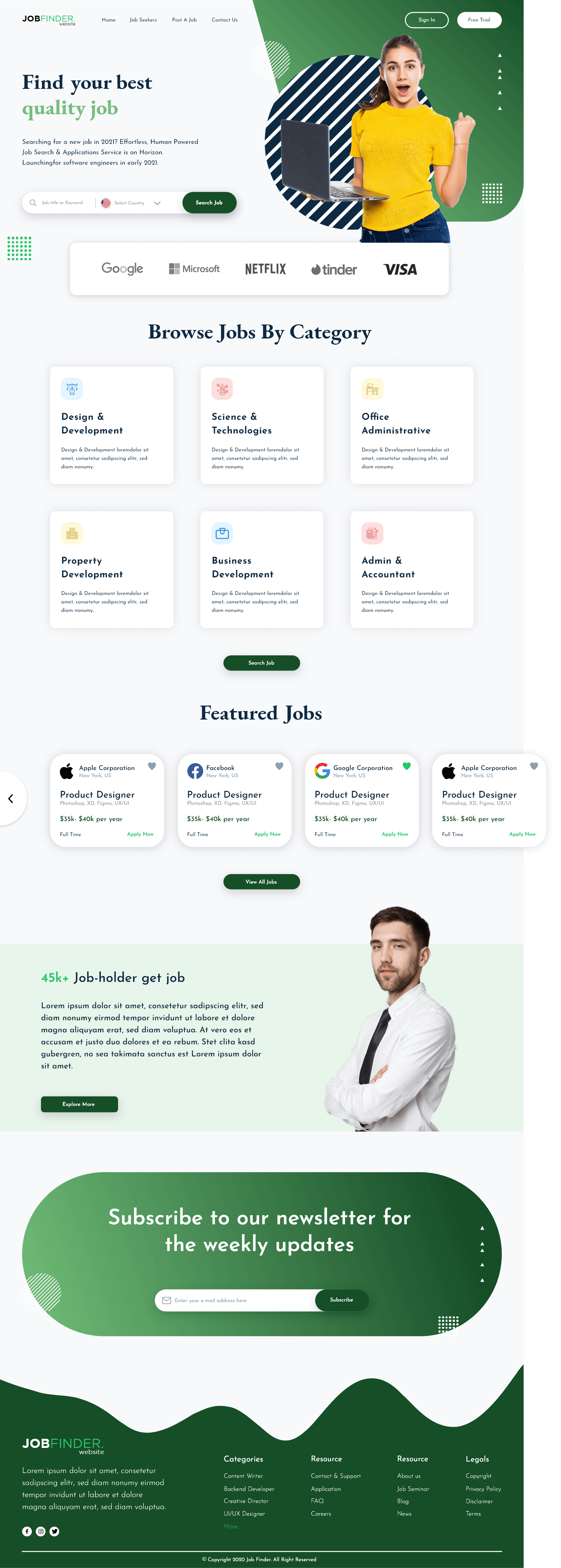
This bold statement is appropriate for today’s modern age. The process of job hunting has become much more straightforward these days. Everything started with a website. They made it easy to recruit and brought in competitive deals, which set the foundation for a full-fledged company.

Project Goal

This project was started with one primary goal in mind: to create a website that is specifically designed for Local Jobs. The main focus of the project was to highlight what they had to offer in comparison to traditional recruiting platforms. This meant a complex back-end structure but also a user-friendly design.

job finder bubble 6

Easy Food ordering Process and increase trust in restaurants and customers

job finder bubble 4

Helps restaurant to reach out to wider range of customers

UI

Colors

Challenges

Problems

Solutions

Visual Design

job finder website template

View Similar Case Studies

  • Education Web - A learning community dedicated to building responsible citizens and empowering all learners.
  • DocWeb - Helping people at their most vulnerable times is a privilege.
  • Job Finder Website - "More than a job… it's an adventure in innovation."

Delicious Food App

Case Study

Delicious Food App

Ate, eating, going to eat… that’s what you must care about.

PROJECT

Description

What's special about this app?

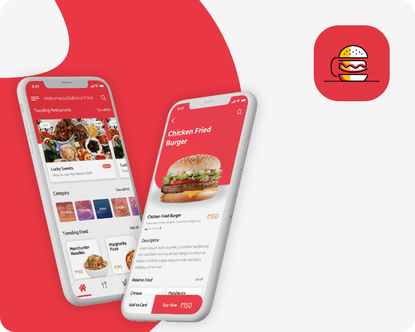
We build four panels of the application User Panel, Admin Panel, Delivery Boy Panel, and Restaurant Panel as per client requirements.    


Admin Panel – Admin Log-in, Manage Customer Account, Manage Restaurant Account, Manage Driver Account, Push Notification.


Customer Panel – Customer Sign-up/Log-in, Navigation Menu, Restaurant List, Restaurant Profile, Food Menu (Categorized), Search/Filter, Food App Cart, Offer and Promo Code, Payment Mode, Rating & Review, Order History, Contact Information of Delivery Boy, Live Order Tracking, Food Order Notification.


Restaurant Panel – Log-in, Dashboard, Content Management, Accept or Reject Orders, Manage Restaurant Account, Payment Management.


Delivery Boy Panel – Delivery Boy Log-in, Payment Claim, Delivery History, Call To Customers.

Project Goal

The main goal for starting this project was to let customers experience delicious food orders at the best prices. The startup wants to build a food ordering application to help the customers to order delicious food from the comfort of their homes or offices. The app provides customers with the accessibility of information of a restaurant such as food menu, location, contact number, review, and rating. Our client was on the lookout for a food ordering app with dynamic design and advanced features for their customers.

circle image 6

Easy Food ordering Process and increase trust in restaurants and customers

circle image 5

Helps restaurant to reach out to wider range of customers

UI

Colors

.
#E93843
.

#E67F3C

.

#E93843

#E67F3C

.

#7CEB8D

.

#000000

.

#9D9EA0

.

#F6F6F7

.
#ffffff

Challenges

Problems

Solutions

Visual Design

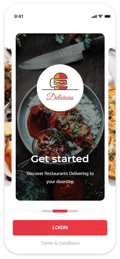
Login

The login page is the entry page that requires user authentication. This is done by regularly entering a username/password combination. Logins can be used to gain access to the app.

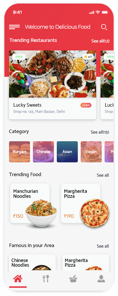
Home

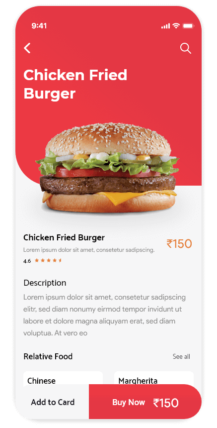
When the user browses the application, they will get preferred food items based on their recently searched or previously ordered items.

Food Details

Provides customers with the accessibility of a restaurant’s information such as food menu, location, contact number, review, and rating.


easy order food app assests

View Similar Case Studies

  • Education Web - A learning community dedicated to building responsible citizens and empowering all learners.
  • DocWeb - Helping people at their most vulnerable times is a privilege.
  • Job Finder Website - "More than a job… it's an adventure in innovation."
JOB Interview App

jobinterview_icon
Case Study

JOB Interview App

Choose a job you love, and you will never have to work a day in your life.

PROJECT

Description

Zero2unicorn created a one-of-a-kind job portal that connects job searchers with employers and the other way around. This portal assists in the management of job ads, applications, and selection processes such as online video interviews.

Project Goal

The brief was to work in a team and identify problems with an existing mobile application, discover opportunities and then apply the UX design methodology to revamp the app. Our team decided to revamp the Jobstreet app.

job interview bubble image -1

Easy Food ordering Process and increase trust in restaurants and customers

job interview bubble image 1

Helps restaurant to reach out to wider range of customers

UI

Colors

Challenges

Problems

Solutions

Visual Design

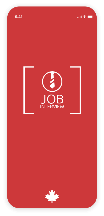
Splash

Users are informed about the app’s functionality.

Home

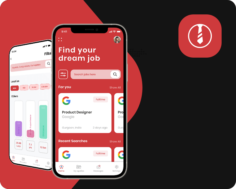
We wanted the homepage to be informative and not just flood the user with job opportunities. We, therefore, focused the main page on recommended jobs as well as recent additions that fit pre-set criteria.

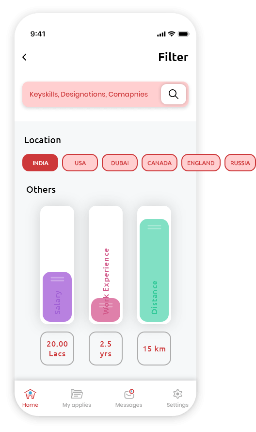
Easy Filters

The filters in the app were designed according to our research and enabled the user to sort by salary, location, and position type.

Easy Apply

Users can easily apply as per their field of interest.

Job Details

Inform the user of the job’s details and requirements.

Travelroute App

Case Study

Travelroute App

Travel makes one modest. You see what a tiny place you occupy in the world.

PROJECT

Description

Travelroute App is a platform where travelers can compare vacation packages from different travel agents or travel groups to find the best deal. They can also personalize it to their liking. The largest benefit is that events and travel packages can be verified, booked, paid for, and security processes and solutions can all be discovered on one platform.

Project Goal

This project had the goal to create a mobile app that would offer a personalized selection of suggestions and activities based on the user’s interests. All stages were completed using UX tools and design thinking. Volunteers and friends performed extensive testing. This was vital to validate the target users and create a product that would revolutionize the way people travel.

bubble 2

Easy Food ordering Process and increase trust in restaurants and customers

bubble 2

Helps restaurant to reach out to wider range of customers

UI

Colors

.
#161616
.
#004359
.
#868283
.

#d0d0d0

.
#ffffff

Challenges

Problems

Solutions

Visual Design

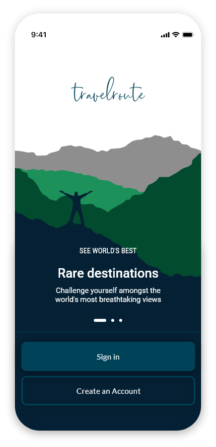
Onboarding

Customers are informed about the app’s features and functionality.

Home

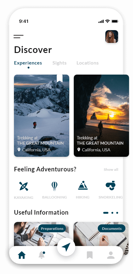
For the home screen, we try to keep things simple and stylish. As a result, travelers will have no trouble finding the information they require.

Trip Details

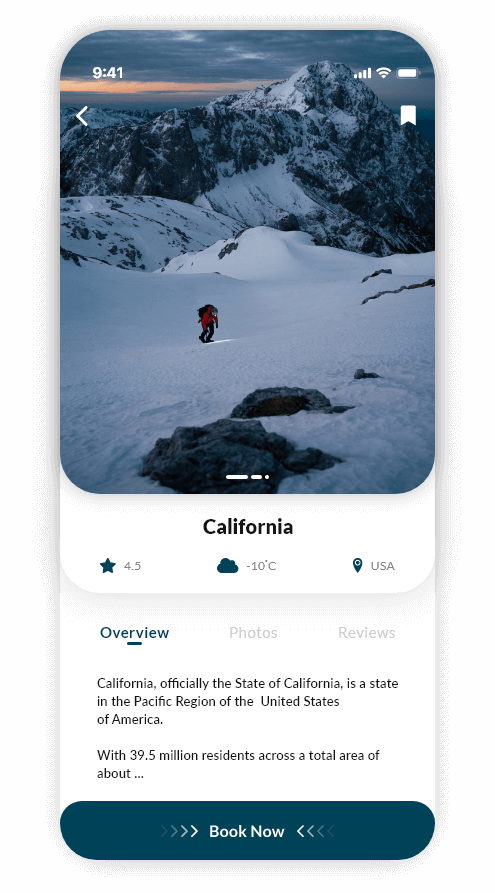
Travelers will be able to examine all of the specifics of their trip. They can also customize their tour itinerary.

Easy Booking

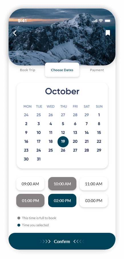
Travelers can book trips; they can choose dates and times as per their convenience. And make payment with a preferred payment method.

View Similar Case Studies

  • Education Web - A learning community dedicated to building responsible citizens and empowering all learners.
  • DocWeb - Helping people at their most vulnerable times is a privilege.
  • Job Finder Website - "More than a job… it's an adventure in innovation."