![]()
Case Study
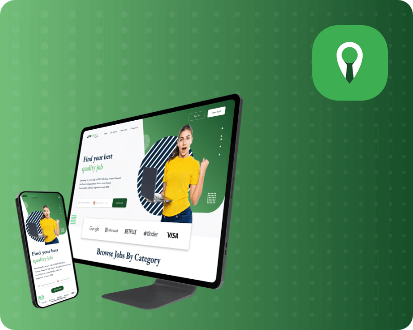
Job Finder App
“More than a job… it’s an adventure in innovation.”
PROJECT
Description
Job Finder’s mission is to find the perfect match between people and jobs ?
This bold statement is appropriate for today’s modern age. The process of job hunting has become much more straightforward these days. Everything started with a website. They made it easy to recruit and brought in competitive deals, which set the foundation for a full-fledged company.
Project Goal
This project was started with one primary goal in mind: to create a website that is specifically designed for Local Jobs. The main focus of the project was to highlight what they had to offer in comparison to traditional recruiting platforms. This meant a complex back-end structure but also a user-friendly design.

Easy Food ordering Process and increase trust in restaurants and customers

Helps restaurant to reach out to wider range of customers
UI
Colors

Challenges

Problems
- There was an abundance of information on this platform, as any job search could lead to multiple company results.
- A number of interconnected facets and material sources make it challenging to access information when needed.
- To reduce color distraction.
- There is no effective mechanism for retrieving information. The search wasn’t working properly.

Solutions
- We decided to make the most of the content easy to read. To avoid guesswork, we only highlighted the most important features and buttons with green.
- An integrated design that provided for easy access to information.
- We reduced the logos and focused on job titles.
- Dedicated search servers are available.
Visual Design

View Similar Case Studies
[display-posts category=”case-studies” include_excerpt=”true” image_size=”full” posts_per_page=”3″]
